Tuesday, March 17, 2009

Project Doodler


Publish your design on your blog and explain it. What are you trying to communicate with your version of the Google logo? What tools did you use?

Answer: I'm trying to show St Patrick day to everyone. Trying to show them what is St Patrick and how green it is. Also by showing them that the day of St patric there should be a pot of gold and St Parick is also includes a rainbow. I use the marquee tool in photoshop, brush tool, gardient tool and also the text affect tool.

Wednesday, March 11, 2009

LB 4Banner


a._What were your initial goals for the page banner?
Answer: My initial for this page banner is to make my banner more colorful using more colors and making my tittle stand out more. Also adding a better picture to my banner. Also by giving people the latest fashion, and the best!

b._What design concepts and principles did you incorporate into the page banner?
Answer: I used colors that stand out.Colors very dramatic and cute. I made my background with a light purple. Howeverv i added a circle and made its background very colorful using 4 colors and making it have a flower pattern. Adding a picture so it can describe more the banner. Also giving it a txt that describes my banner and says what my banner or website is about. However to make the txt stand out more i added a glow.

c._How was each design concept intended to contribute to communicating the purpose of the page banner?hat
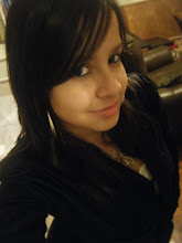
Answer: The colors i used which were pink black, blue and purple are colors grab attention and colors that when u read the title Fashion Freak comes to mind. Pink, black, purple and blue are colors that deal with fashion alot. The picture I used, i picked it because I think it makes people think that is a very colorful website and the fashion is very frutie, nice looking and the very latest fashion.

d._Do you have new goals in mind for the page banner? If so, what are they and why?
Answer: Yes I do one of my goals is to add a another pic and make the banner side blur. Also to make my banner a little more bigger so it won;t look to small and i would be able to add more stuf.

Thursday, March 5, 2009

LB 3 Diana Londono Name Plate


What were your initial goals for the logo?
Answer:My initial goals was to make the name plate using my favorite colors yellow and blue. Make a pattern combining the color.Making my name stand out a little more than the background but not to much. Their was going be shapes such as stars. Making my my main star which had to be right next to my name before my name starts. Making this star big and making it as a shooting star. Also for my name plate have a shadow. Its suppose to describe me and make people want to read my websites, for them tto enjoy.

Does the logo have match the initial goals? why or why not
Yes and No. Yes because my name plate was yellow and blue and it had a pattern. My name plate had a shadow which made it stand out much more. My name plate stand out, but it didn't stand out as i expected. Also my name plate didn't have no shapes and especially didn't have any stars or shooting star. However it describe me but not completely, it wasn't verry attractibe but is still grabs attention.